Fixing Css Navbar Image Size In Safari
Friday, January 07, 2022
I have a problem. That problem is my CSS looks all screwed up for my website. The problem can be seen visually below:

A quick search on StackOverflow yields a pretty good Q&A. My problem is also with Safari as in the question. Now, I did the thing where I quickly try to fix a problem without understanding the issue deeply. I think this makes sense a lot of the time. However, there was an interesting part of the answer that struck a cord with me:
If something like this happens to you in the future you need to debug it.
In this particular case I think the responder on StackOverflow meant that if this happens again you need to use the browser's debug tools. He includes a very nice gif of him debugging in action. However, the reason that what he said resonate with me is that I often have a tendency to just "get shit done" rather than understanding deeply. The alternative is to stop and really think deeply about the problem and why reality does not meet my expectations. There is a trade-off here. Do I really think that knowing more about Bootstrap NavBar CSS is going to vastly improve my life? Probably not. But it is the mindset of being curious, wanting to know more, and holding yourself to a higher standard of understanding that yields benefits over time. If I am going to continue to be a professional in tech, which I plan to do, I need to remind myself at these junctures that this striving for deep understanding not only will pay off but the benefits compound. This ethos is perfectly summarized in the About page on https://jvns.ca/:
"I have one main opinion about programming, which is that deeply understanding the underlying systems you use (the browser, the kernel, the operating system, the network layers, your database, HTTP, whatever you’re running on top of) is essential if you want to do technically innovative work and be able to solve hard problems."
This example is not something we're running on top of (it is closer to Layer 5/6 in the OSI model) but for me it is still foreign. I am not a self-styled CSS connesiour. But if I want to build websites that don't suck to look at and are easy to use then I need to dig in a bit and figure out what is going wrong here.
The Problem
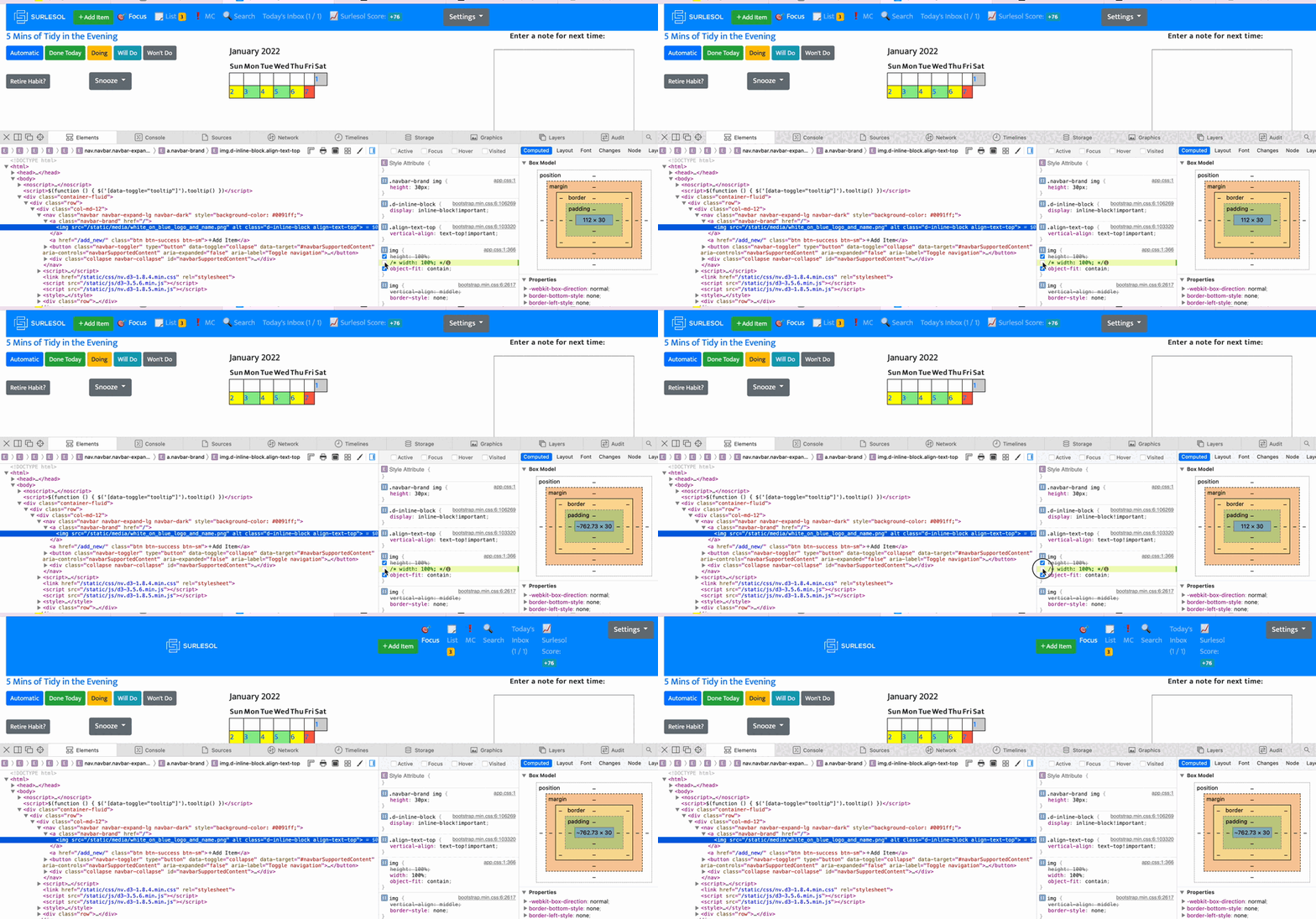
By inspecting the element and toggling the CSS that I could make the image look how I wanted to in one view:

But the change would break down on another pages.So, the quick and dirty change s not going to cut it here. The odd thing is that everything looks good in Firefox and Chrome. What makes Safari different? The first thing I looked for here were any anomolies between the CSS application between Firefox and Safari. Both had -webkit-text-size-adjust: 100% showing an invalid value but I didn't see anything else obvious. My next train of thought took me too inspecting the interaction between the rules for .navbar-brand img and img:
.navbar-brand img {
    height: 30px;
    }
img {
    height: 100%;
    width: 100%;
    object-fit: contain;
}
Now one of the things I want to play with is the width of the .navbar-brand img and seeing how it responds. Something I always forget is that I don't need to reload the entire website upon each CSS change... I can just change it directly with the Dev Tools.
So what I think was happening was that the navbar brand img 30px height overriding the img 100% but there was no .navbar-brand img width so 100% was being utilized. Simply adding width: 100px seems to have done the trick for now.
.navbar-brand img {
    height: 30px;
    width: 100px;
}
And voila! I ran into some tricky issues with getting the CSS to update properly as I needed to quickly check 'development mode' in CloudFlare

And now the NavBar does not look like crap on mobile!!